The Science of Color Scheme in Birthday Flyers
In the dynamic world of event promotion, the importance of a well-designed birthday flyer cannot be overstated. Amidst the myriad elements that contribute to an impactful design, the science of color schemes emerges as a fundamental and nuanced aspect. Beyond mere aesthetics, the colors chosen for a birthday flyer hold the power to evoke emotions, convey themes, and capture attention. This article delves into the intricate realm of the science of the color scheme in birthday flyers, providing insights, tips, and real-world examples to elevate your birthday flyer design.
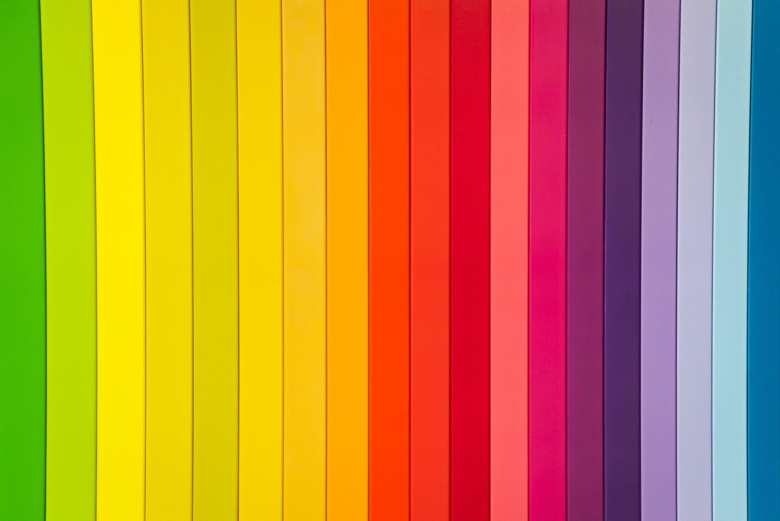
The Psychology of Colors
Colors are not arbitrary; they carry psychological weight, influencing emotions and perceptions. Understanding this can be a game-changer in designing a birthday flyer that resonates with the audience.
Red: Energy and Passion
The color red is synonymous with energy and passion. It’s bold and attention-grabbing, making it ideal for conveying excitement and a vibrant atmosphere in birthday celebrations.
Blue: Calm and Tranquility
In contrast, blue exudes calm and tranquility. This color can be employed to create a more relaxed and serene ambiance for events like intimate gatherings or surprise parties.
Yellow: Joy and Optimism
Yellow radiates joy and optimism. It’s a fantastic choice for celebratory occasions, adding a sunny and cheerful disposition to your birthday flyer.
Green: Freshness and Growth
Green is associated with freshness and growth. Consider incorporating green hues for outdoor or nature-themed birthday parties, creating a sense of vitality.
Choosing the Right Colors for Birthday Flyers
The process of selecting colors for a birthday flyer is a delicate art, influenced by factors such as the age of the celebrant, the theme of the party, and personal preferences.
Age-Specific Color Preferences
For children’s birthday parties, vibrant and playful colors are often preferred, while adults might lean towards more elegant and muted tones. Understanding the age demographic is crucial for striking the right chord with the audience.
– Bright and Playful Colors for Kids
Children are drawn to bright and playful colors. Incorporating a palette of primary colors or pastels can create an inviting and lively feel for a child’s birthday celebration.
– Elegant and Muted Tones for Adults
Adults, on the other hand, might appreciate a more sophisticated color scheme in birthday flyers. Consider using deeper tones or complementary colors to convey a sense of maturity and refinement.
Trending Color Combinations for Birthday Flyers
Staying abreast of color trends is essential for ensuring your birthday flyer remains contemporary and visually appealing.
Seasonal Trends in Birthday Flyer Colors
Just as fashion trends evolve with the seasons, so do color preferences for event promotions. Spring may usher in pastels and floral accents, while warm tones dominate summer celebrations.
– Spring Pastels and Floral Accents
Spring-inspired color schemes often include soft pastels like blush pink, mint green, and lavender, coupled with floral accents for a refreshing and lively feel.
– Warm Tones for Summer Celebrations
Summer, with its sunny disposition, welcomes warm tones such as coral, golden yellow, and aqua, infusing a sense of vibrancy into birthday flyers.
Thematic Color Choices
Thematic color choices add depth and context to your birthday flyer, aligning it with the overarching theme of the celebration.
– Nautical Blues for Seaside Themes
For a beach or nautical-themed party, blues and whites mimic the ocean, creating a cohesive and visually appealing color scheme.
– Metallics and Glitter for Glamorous Parties
Glamorous affairs call for metallics and glitter. Gold and silver accents can elevate the sophistication of the flyer, hinting at a lavish celebration.
Impact of Colors on Readability
While the aesthetic appeal of a birthday flyer is crucial, it should never compromise the primary function: to convey information clearly. Here’s how color choices impact readability.
Contrasting Colors for Legible Text
Choosing colors with sufficient contrast ensures that text remains legible against the background. Dark text on a light background or vice versa is a classic and effective choice.
Font Selection for Maximum Visibility
Beyond color, font selection plays a pivotal role in readability. Opt for fonts that are easy to read, especially when using decorative or script fonts sparingly.
Creating Visual Hierarchy with Colors
Colors can do more than catch the eye; they can guide the viewer’s attention and create a hierarchy of information.
Balancing Background and Foreground Colors
To establish a clear visual hierarchy, balance the background and foreground colors. The background should complement the foreground elements without overshadowing them.
Using Accent Colors to Highlight Key Information
Strategic use of accent colors draws attention to key information. Whether it’s the event date, venue, or a special offer, accent colors can guide the viewer’s focus.
Color Schemes for Different Themes
The theme of a birthday celebration often dictates the color scheme in birthday flyers. Understanding how different themes align with specific color palettes enhances the overall cohesiveness of the flyer.
Vintage Vibes: Soft Pastels and Retro Accents
For a vintage-themed celebration, soft pastels and retro accents transport the audience to a bygone era. Think dusty rose, mint green, and sepia tones.
Modern and Minimalistic: Monochromatic Schemes
Modern and minimalistic themes thrive on simplicity. Monochromatic color schemes, using varying shades of a single color, exude sophistication and elegance.
Tropical Paradise: Bold and Bright Colors
Transport your audience to a tropical paradise with bold and bright colors. Think of a vibrant combination of tropical hues such as turquoise, coral, and sunny yellow.
Accessibility Considerations in Color Selection
In the pursuit of aesthetic appeal, it’s crucial to ensure accessibility for all viewers.
High Contrast for Readability
Maintain high contrast between text and background colors to enhance readability. This is particularly important for viewers with visual impairments.
Designing for Color-Blind Viewers
Consider color-blind viewers when selecting color schemes. Utilize tools that simulate color blindness to ensure your flyer remains comprehensible to a diverse audience.
The Role of Color in Branding
For those organizing frequent events, consistent color choices contribute to brand recognition.
Consistent Color Choices Across Events
Establish a consistent color palette across various events to create a cohesive brand identity. This fosters recognition and reinforces the brand’s visual presence.
Building Brand Identity Through Color
Colors are integral to brand identity. Leverage the emotional associations of your chosen colors to reinforce the desired image and perception of your brand.
DIY Tips for Designing a Vibrant Birthday Flyer
Empower yourself with practical tips to create a visually appealing and vibrant birthday flyer.
Exploring Color Harmonies
Experiment with color harmonies, such as complementary, analogous, or triadic schemes, to discover visually pleasing combinations that enhance your flyer’s appeal.
Balancing Elements for a Cohesive Design
Strike a balance between colors, text, and images for a cohesive design. Avoid overwhelming the viewer with too many elements and maintain a harmonious composition.
Feedback and Testing Your Color Scheme
Designing is an iterative process. Encourage readers to seek feedback and test the impact of their chosen color scheme in birthday flyers.
A/B Testing for Optimal Results
Implement A/B testing to compare the effectiveness of different color schemes. Evaluate which version resonates better with your target audience.
Gathering Audience Feedback for Fine-Tuning
Share your design with friends, family, or online communities to gather diverse perspectives. Constructive feedback aids in fine-tuning your color scheme for maximum impact.
Common Mistakes to Avoid in Color Selection
While experimentation is encouraged, certain pitfalls should be avoided.
Overuse of Bright Colors
While vibrant colors can be attention-grabbing, overusing them can lead to visual chaos. Strike a balance to maintain a visually pleasing composition.
Clashing Combinations: Finding the Right Balance
Avoid clashing color combinations that create visual discomfort. Aim for harmonious blends that enhance the overall aesthetic without causing distraction.
Conclusion
In the vibrant tapestry of birthday flyer design, the science of color scheme in birthday flyers is an indispensable thread. As you embark on your creative journey, remember that color is not just visual; it’s emotional. Experiment, learn, and let your creativity shine. The perfect color scheme has the transformative power to turn a simple flyer into a memorable work of art.
Also, read:
10 Essential Skills High School Students Need for Success in the 21st Century